The Seven Operational Workflows Every Small Nonprofit Runs (and Where They Break)
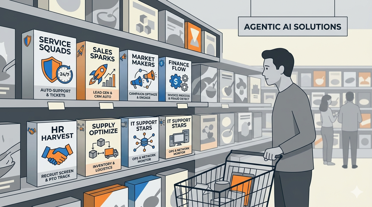
Based on my experience working for about a dozen nonprofits throughout my career, I've noticed something: most organizations run the same seven workflows. The names change, the tools differ, but the underlying work is remarkably consistent.
The problem isn't that staff are disorganized or that technology is missing. The problem is that nobody has mapped how work actually flows. Most small nonprofits have grown their processes organically — a spreadsheet here, an email thread there, a shared folder someone set up three years ago. The result is a system that technically works but quietly consumes far more time and mental energy than it should.
In this post, we'll name the seven workflows, describe where they typically break, and show what it looks like when they're redesigned. Whether your organization uses Microsoft 365, Google Workspace, or another platform, the operational patterns remain the same — and the improvement opportunities are identical.
The seven workflows
1. Donor & constituent management
Where it breaks: Donor information lives in someone's personal spreadsheet, the executive director's inbox, or a CRM subscription that costs $200/month and gets used by only one overworked team. Thank-you letters are drafted from memory. Major donor cultivation depends on whoever remembers to follow up.
What it looks like redesigned: A centralized database tracks every donor relationship with fields that match your actual cultivation strategy. Segmented communications reach donors automatically based on their relationship tier and giving history. Major donors can schedule time with leadership through a simple booking process. Personalized thank-you letters cite actual program outcomes from the quarter — in your voice, grounded in real data.
2. Grant lifecycle
Where it breaks: Grant deadlines surprise people. Past applications are scattered across laptops. Reporting requirements get discovered after the award is accepted. Budget narratives are rewritten from scratch every time because the last version is unfindable.
What it looks like redesigned: A shared pipeline shows every active grant with clear stages (prospect, applied, pending, reporting, closed). A centralized document library stores every application and funder guideline with version history. Automated reminders trigger at 90, 60, and 30 days before deadlines. Budget narratives are drafted from your actual financials and pull language from your three most successful past applications — cutting grant writing from days to hours.
3. Program delivery & case management
Where it breaks: Case notes live in notebooks or individual Word documents. Client files aren't accessible to the whole team. Intake is a paper form that gets transcribed twice. Outcome tracking happens in a quarterly panic when the funder asks for numbers.
What it looks like redesigned: Digital intake forms capture data that flows directly into a centralized case management system with role-based access. Program staff stay coordinated through shared communication channels without daily check-in meetings. Milestone tracking shows each client's progress against their service plan. Case summaries and compliance-ready documentation are generated on demand — eliminating the quarterly scramble.
4. Board & governance operations
Where it breaks: Board packets take a full day to assemble. Financials are pulled from one system, program updates from another, and nobody formats the document consistently. Board members email questions that should be answered in the bylaws, but the bylaws are a PDF from 2019 that nobody can find.
What it looks like redesigned: A document library with retention policies houses all governance documents, searchable and version-controlled. Committees stay organized through shared workspaces. Action items between meetings are tracked with clear owners and deadlines. Monthly packets assemble automatically — pulling financials from your bookkeeping exports and program updates from your centralized data sources — with questions about bylaws and policies answered by citing the actual documents.
5. Staff & volunteer coordination
Where it breaks: Scheduling depends on a whiteboard or one person's memory. Time-off requests come via text message. Volunteer onboarding is an oral tradition: "just shadow Maria for a day." Job descriptions and policies live in the head of the longest-tenured employee.
What it looks like redesigned: Staff scheduling is centralized and visible, with clear approval workflows. Volunteer applications trigger automated onboarding checklists that new volunteers can self-serve. A searchable knowledge base answers "what's our PTO policy?" and "how do I process a reimbursement?" without interrupting anyone, keeping institutional knowledge accessible to the whole team.
6. Compliance, records & audit readiness
Where it breaks: Retention policies are understood but not enforced. Records are scattered across personal drives, cloud storage, and email. When an auditor asks for three years of program documentation, it takes weeks to assemble. Staff don't know what's kept where or for how long.
What it looks like redesigned: Retention rules automatically classify documents by type and apply the right lifecycle. Audit logs track who accessed what and when. Searches across the entire records repository return results in minutes, not days. Staff ask "what's our records retention policy for donor files?" and get the exact answer from your governance documents — not a guess. Auditors can access what they need without disrupting operations.
7. Communications & marketing
Where it breaks: Newsletters are inconsistent because there's no editorial calendar. Social media is whoever has time. Annual reports are a three-month project that starts two months too late. Impact stories that would motivate donors never get documented.
What it looks like redesigned: An editorial calendar tracks content with owners and deadlines. Impact stories are captured from program staff at the point of service — not six months later when nobody remembers the details. Newsletter copy, social posts, and annual report narratives are drafted from your actual program data and client outcomes, maintaining your organization's voice throughout.
Where CoreConductor fits
Whether you use Microsoft 365, Google Workspace, or another platform, those tools are the right foundation. They're where your email lives, where your documents are stored, where your team already communicates. But all major platforms have boundaries:
- They can't draft a grant application grounded in your last three successful submissions
- They can't answer a board member's question by searching your actual bylaws, minutes, and policies with confidence
- They can't generate an annual report narrative from your program data while maintaining your voice
- They can't work entirely offline, with zero data leaving your network
That's where CoreConductor extends your existing tools. It handles the document-aware intelligence that most platforms aren't designed for — but it does so inside your network, trained on your actual documents, with your data never leaving your control.
Working across multiple platforms?
Many nonprofits use a hybrid of tools: email in one system, case management in another, financials in a third. Our free operations review can map your actual workflow across all your existing systems and show where intelligence and automation will have the biggest impact — regardless of your tech stack.
How to start
You don't need to redesign all seven workflows at once. In fact, you shouldn't. The most successful strategy is to start with one or two workflows — usually either donor management or grant lifecycle — because those are where the time savings are most visible and the ROI is easiest to explain to a board.
The first step is always the same: map the workflow as it actually runs today. Not how it should run. Not how the org chart says it runs. How it actually runs — with the email threads, the spreadsheets, the hallway conversations, and the workarounds that staff have built to keep things moving.
Once you have an honest map, the technology choices become obvious. Sometimes it's a new database configuration. Sometimes it's an automation that saves two hours a week. Sometimes it's CoreConductor. Most often, it's some combination — configured to match the workflow, not the other way around.
Ready to redesign your workflows?
Our free operations review is a one-hour conversation where we map your actual workflows, identify the highest-leverage redesigns, and show you exactly where your existing tools can improve — and where additional automation or intelligence would help. No obligation to work together afterward.
Start Your Free ReviewFurther reading
- What We Do — How we approach each of the seven workflows with platform-agnostic design principles
- Implementing the Seven Workflows in Microsoft 365 — Specific tool configurations and automation patterns
- Implementing the Seven Workflows in Google Workspace — Specific tool configurations and automation patterns
- CoreConductor — Document-aware intelligence that extends your existing tools
- The Mirror Has No Therapist — Part 1 of our AI ethics series